Mac Folkes has a vision and a voice and in the creation of The Slant he has made an artifact that defines the zeitgeist. Though it is a pure piece of printed matter it is neither book nor magazine nor journal nor zine. It is a work of art unto itself that is as much a publication as a piece of origami.
The art of folded paper transforms the two dimensional into three, and The Slant does just this, and then it goes further, you see. Because it combines the image with text, centered around a single them to explore at leisure and in depth. The first issue of The Slant focuses on shame and takes what is perhaps the most painful emotion of all and allows us to consider it in a dynamic new way.
The Slant creatively combines wit and wisdom to reconceptualize our approach to the printed object and provides us with a multi-layered work that allows us to take pleasure that combines in equal parts the aesthetic and intellect sensibilities. “I am a deep romantic,” Folkes observes. “A true believer. I want to be heard. I see the finish line and as it comes it starts getting larger and larger and it makes me think about what I want to leave behind, a legacy.”
Born in Jamaica, Folkes moved to New York City at the age of five but defines two sources of his native land for eternal inspiration, “Bob Marley for truth and Grace Jones for beauty.” And with these iconoclastic visionaries setting the pace, Folkes is right on time, reinventing print in a brand new way.
The Slant began as a newsletter for UnionMade, a shop based in San Francisco, a sophisticated takeaway that allowed shoppers to have an original souvenir of their experience. And as The Slant gained popularity, Folkes thought about how to re-envision it in a powerful way. “It is something ephemeral for these ethereal times,” he observes, noting that on the cover is The Slant’s mission, “Something to Have and to Hold.”
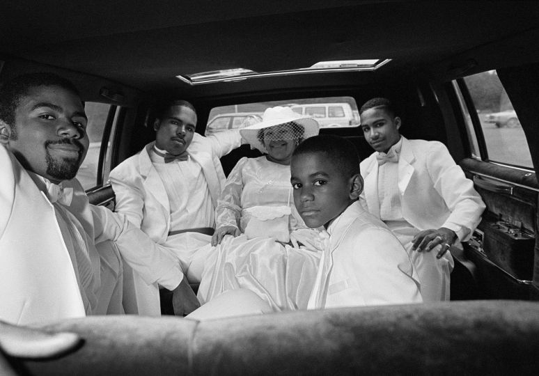
Working as the creative director, Folkes leads a team of three who are dedicated to creating work that combines photography, art, and illustration with a casually sophisticated sense of art direction. Perhaps it seems so simple because it is not, for The Slant proves with its edgy aesthetic that provocative is hot. For example, the back cover has a photograph of two women with the words PASS and FAIL printed over each of their images. PASS is given to Lena Horne, who looks ultra feminine in her Hollywood goddess-like ensemble. FAIL is given to Nina Simone, who wears a short cropped natural and a pendant of Africa. But what makes this comparison truly a thing to behold is that the photographs are printed on brown paper, the same brown paper used for the historical “paper bag test” given to African Americans to determine if they could pass as Caucasian by virtue of comparison to this shade of pale brown.
The paper bag test is something writ large in African American culture, but something never discussed by Caucasian, most likely because they have no knowledge of or use for it. And by placing this subject so prominently upon The Slant, Folkes removes the shame by casting its aspersions in our face. The result is that it is at once hilarious and sad, awkward and obvious, calling out not only America’s racism but the internal prejudices it forced upon the African American community. And, perhaps what makes this image so powerful is that most Caucasians who see this image will have no point of reference to the subject of passing at all. Is that a PASS or a FAIL? I wonder…
As Folkes explains, “The Slant is the antidote to the obvious.” It unfolds, literally and organically. It unfolds as both a metaphor and a way of seeing. It has no advertisers; it answers to no one except to the standards that Folkes sets for himself. As a result, this artifact printed in an edition of one thousand is available exclusively at stores including BookMarc, Dashwood, and UnionMade—the places aesthetes frequent with something resembling compulsive desire. And when placing their hands upon The Slant they will discover something new, something unlike what they have seen before because The Slant is the future.
As print declines, the dead weight falls away and what remains is what it does best: communicate as a sensory pleasure. Print is an object to behold, to see and to touch and to experience in real time and space. And so it is The Slant occupies space as nothing I have ever seen, as its pieces come apart and take over pieces of furniture as they unfurl their meaning. And as they do this, tiny little things can be discovered, like the way in which we relate to the printed object is not a linear process.
Because The Slant is designed as a simultaneous experience, one cannot relate to exploring it by anything other than sheer intuition. It is non-linear and in some ways, it almost feels cyclical, as pages come apart and turn over on themselves. And as they turn over, tiny little details are discovered, and finding these little gems feels like mining for gold. And as Folkes notes, the very last item reflects the spirit of the piece for the tine triangle that opens and closes the artifact speaks to the inclusive spirit of art in the greatest sense. “Welcome to the Fold,” is what is says, and when you pull open The Slant you’ll know just what that means.


