To pay tribute to Elizabeth Avedon, The Eye of Photography is republishing this interview that previously appeared on August 22, 2016 in Lenscratch, a daily journal that explores contemporary photography. Featuring Elizabeth Avedon’s Mixtape, we here learn more about her remarkable life and celebrate her contributions to our community.
Constructing this Mixtape was incredibly exciting,I learned in-depth about a friend and design icon who has traversed a remarkable photographic terrain, creating a legacy for excellence and creativity. The Elizabeth Avedon blog is a go-to destination for photographers, bringing her unique perspective to her observations and posts. I first met Elizabeth Avedon when she reviewed my work at Review Santa Fe. I had no idea what to expect, but it turned out that our twenty minutes was my favorite of the event. She was warm, funny, engaging, and encouraging. We kept in touch and several years later, when I was exhibiting in New York, she attended my opening. It was a reflection of the kind of person she is, someone who makes the extra effort to support, encourage, and educate. It was great to reunite with her in Chicago at the Filter Photo Festival this past fall.
Elizabeth carries a lifetime of creative seeing, that combined with her exposure to the greats of design and photography, add up to a remarkable ability to make her mark on all aspects of design that surround the photograph. Her down-to-earth generosity and unflagging enthusiasm for all things photographic make her a very special member of our community. It is with great pleasure that I introduce The Elizabeth Avedon Mixtape.
Tell us about your growing up and what brought you to photography.
I had a sort of wacky childhood growing up in Texas just as it was on the brink of transitioning from a rural western countryside with farms and ranches, to the 60’s oil boom and rapidly growing Space Center. Before the change, my older sister and brother could still ride their horses to school; there really was just a little red schoolhouse. On weekends my family went on trail rides on an endless dirt road. It’s now I-10, a major ten lane highway! However my father, a transplanted New Yorker and amateur photographer, had a lot of friends that were LIFE Magazine photographers. They would come down to our place in Texas and use our stables as a backdrop for their stories. I was in LIFE Magazine twice as a child and remember being awed by all the photographic equipment that arrived in big black metal cases, out of which unfolded huge arrays of lights, tripods, cameras, and lenses.
My father used to bring celebrities to Houston for the Rodeo, so I was photographed with everyone from Roy Rogers and Dale Evans, Marshal Dillon and Wyatt Earp (or the actors who played them), to greeting Lucille Ball and Desi Arnaz with red roses on my horse Diamond on the airport tarmac with the Harris County Sheriffs Mounted Posse on horseback circling around. I later sat on Desi’s lap as they were interviewed on a stage set for television. Lucy was a huge star at the time and I was aware of all the photographers’ camera’s, and media surrounding these events.
My mother had been a fashion model in New York, so I spent countless hours studying the photographs of Irving Penn, David Bailey, Henry Clark, Burt Stern, Horst P. Horst and Richard Avedon in the stacks of her latest fashion magazines. I scrutinized LIFE, Esquire and National Geographic, and the work of Gordon Parks, Alfred Eisenstaedt, Eve Arnold, Slim Aarons, Art Kane and Bill Eppridge. I wasn’t literally aware of their names back then, but I remembered all of their images.
When I moved to New York to go to Parsons School of Design, I brought three of my father’s old Leica 3f’s with me. To my great fortune Tod Papageorge was my first formal instructor in Photography there. He later went on to become the Walker Evans Professor of Photography and Director of Graduate Studies in Photography at the Yale School of Art, only recently retiring after 30 years. Tod was an extraordinary guide, opening up the worlds of Walker Evans, Robert Frank, Kertész, Brassaï, Atget and Cartier-Bresson. He taught me the merits of shooting with Leica’s, the mysteries of developing and printing film and gave me an ongoing appreciation for black and white photography and a passion for street shooting. In the early 70’s I was allowed to hang out with his tight Museum of Modern Art circle sometimes after class. This awesome group consisted of Garry Winogrand, Paul McDonough, and Joel Meyerowitz. I remember quietly absorbing their conversations about photography and John Szarkowski, and even had the chance to occasionally follow them around as they photographed in the streets. It’s doubtful they remember, as this was obviously a bigger deal to me than to any of them.
During my first few years in New York I met many photographers, some successful at the time, others not yet well known, some still assistants to now forgotten photographers. Not so famous at that time was Saul Leiter. His friends and I would all meet at the now defunct Ratner’s Kosher Delicatessen on the Lower East Side, which was open all night, shooting photographs of the crazies and kooky people who hung out there late at night. I once went on a cruise in the Caribbean as a model for the French Line M.S. deGrasse with Saul as the photographer for the shoot. I have a few beautiful color slides he took of me somewhere.
Also while at Parsons, I met Marvin Israel who changed the course of my life. Marvin was best known for creating, along with Doon Arbus, the first retrospective of Diane Arbus’ photographs at the Museum of Modern Art; as well as designing and editing her famous Aperture Monograph, now in it’s umpteenth printing. After graduating from Parsons, I worked as his assistant on several books and for years after he was a close friend. He was instrumental in introducing me to his best friend, Richard Avedon, and I began assisting both of them editing thousands of contact sheets toward a future project. So my first real work in the photo world, started at the top with the most exceptional photographs…
What is your title and job description and tell us about a typical day?
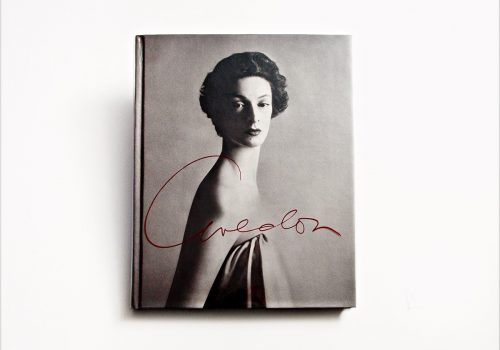
I’ve always worn several hats at the same time, so it’s always a challenge, or never been possible to create a single job description or title. I’ve collaborated with museums, publishing houses, advertising agencies, and galleries, including editing and designing the retrospective exhibition and book Avedon: 1949-1979 for the Metropolitan Museum of Art, Dallas Museum of Fine Arts, and High Museum, Atlanta; Avedon: In the American West for the Amon Carter Museum, Corcoran Gallery, and Art Institute of Chicago.
I worked in advertising as Art Director for Ralph Lauren on national ad shoots and a decade later worked for his son, David Lauren, as Photo Editor on his then new venture, Polo.com Magazine. I moved to New Mexico briefly where I was Gallery Director at Photo-eye. There’s a great Photography scene there and I met a lot of interesting people involved with it, but missed my sons in New York too much and moved back.
This month is a good sample of the eclectic mix of work I do. I wrote my impressions of Vivian Maier in an essay for the recently published book Self-Portraits: Vivian Maier (powerHouse). There was a book signing at Howard Greenberg Gallery this month with Vivian Maier’s filmmaker and editor, John Maloof, at the opening of the exhibition of the same name. I designed new company logo’s, “Inez and Vinoodh” and “Pretty Much Everything,” for the incredible fashion photographer team, Inez Van Lamsweerde and Vinoodh Matadin. I’m very excited about how they turned out. I edited and sequenced photographs for an exhibition by Magdalena Sole at the Leica Store Soho in New York. The show included several of her series; moving images taken in the aftermath of the earthquake and tsunami in Japan, her beautiful series from the Mississippi Delta, and new images shot in Cuba. This is the third exhibition I’ve worked on with Ms. Sole. Photographer Sean Perry and I crafted an event he produced about editing photographs for a program he started called The Picture Review for his Photography classes in Austin, Texas. I shared my thoughts on design, editing, sequencing , how we connect with certain images and working with large groups of photographs, including an ongoing project I am designing and developing with Mr. Perry, Fotopolis. I juried an exhibition called FACES for the Darkroom Gallery. There were a record number of entries received so it was challenging to edit down to a small group for their shows and a handful for Jurors Choice and Honorable mentions. I posted several interesting photographers work I met at the recent Filter Photo Festival on my Photo-Journal blog, along with a few short book reviews, one on Photoeye’s newsletter of Photographer Nick Brandt’s trilogy documenting the disappearing natural world and animals of East Africa. I teach undergrads in the BFA Photography & Video department at the School of Visual Art once a week and in the summer, I teach a Thesis Book Design and Branding class in the Masters in Digital Photography program. It’s a great opportunity to view up-and-coming photographers work and to watch their careers grow over time.
I was in the midst of transcribing several hours of tapes of Saul Leiter discussing his career and gossiping about artists from two centuries ago at a recent dinner, when there was the very sad news of his passing…
What are some of your proudest achievements?
Beyond the physical objects I design, I’m most inspired by the opportunity to construct the ephemeral space around exhibitions. Building temporary environments to best communicate what the artist’s work expresses in a physical way is a great challenge. It’s the chance to elevate the pictures to a true and immersive multi-dimensional experience.
It started with the retrospective exhibition of Richard Avedon’s fashion photography I designed at the Metropolitan Museum of Art. What I learned crafting that project gave me the tools to work with throughout my career. This was almost an eight plus year project. The exhibition was in 1979, one of the most successful shows the Metropolitan had up to that point, except for Tutankhamen. When I came into the picture on Marvin Israel’s recommendation, I was to help edit contact sheets from all of Avedon’s fashion shoots over the past 40 years. This was of course before computers and digital files, so it took a team of darkroom printers many years to accomplish. The contact sheets were in chronological order in endless cartons. It took years to edit down to a manageable group and then edit those down to 2 or 3 choices from each chosen sitting…. After working on it with RA for several years and creating an extensive book dummy, Dick was going to hire someone to design the exhibition at the Met. I knew the work inside out and had a vision of how I saw it, complete and laid out – so told him about it. I asked him to hire me to redesign the space to fit the work and he did.
I had a foam core model of the space to the scale of 1” = 1’. I had all the choice images printed to that scale in several sizes. I designed the show into four continuous rooms, starting out small then increasing in size and brightness as the work became larger and backgrounds became whiter. The first room was like a small jewel box with his early work in Paris in the 1940’s, framed in Parisian gold leaf wood frames, overall dimly lit with images spotlight. The second room was the 1950’s, whiter backgrounds, fashion house ladies in groups, Mike Nichols and Suzy Parker acting out as Liz and Dick, brighter lighting but still traditional horizontal hanging. In the third room, The 1960’s, the space became larger, the ceiling higher, the lighting was bright with large prints up and down the walls. The last room he called his Icons. 6 or 7 very large portraits of “real” women, not fashion models, white backgrounds, extremely large prints unframed hanging just simply as in a cathedral. The last photograph in the show was a gorgeous print of artist June Leaf (aka: wife of Robert Frank).
From there I was able to design Avedon’s work In the American West into the unique architecture of the Amon Carter Museum. The earlier exhibition I designed at the Metropolitan deeply informed this project, as well as those that came after.
I’m also proud of several in-depth interviews I conducted for Jean-Jacques Naudet’s former publication, La Lettre de la Photographie, now The Eye of Photography, Howard Greenberg, Joel Peter Witkin, Wm. Hunt, Anne Tucker, Jack Woody, and Elisabeth Biondi come to mind first. I’m hoping to expand on them in a future book.
What do you look for when attending a portfolio review?
I like a lot of different styles and genre’s of work, but in all I look for some consistency in the subject matter or the eye of the photographer or a cohesive look to the work. A vision or obsession the photographer is committed to. I try to look past their technical skills (unless they are really atrocious) to see the images being projected. I’m also looking for something that is indefinable, something that evokes mystery or a point in time captured in the past suggesting unknown possibilities for the future. It’s really hard to say until I see it.
Any advice for photographers coming to a review event?
Simplify. Practice.
I don’t think I’m saying anything new when I say “Be Prepared.” Bring in one solid project, approximately 12-15 images, 20 max. Be prepared to speak about them, but know the entire encounter may only be 15 minutes. Allow 5 minutes to explain your work, give the reviewer 10 minutes to give feedback. If you do all the talking, what have you learned? You leave with exactly what you came with. Research your reviewers before meeting them. Not all reviewers will respond to your work. Listen to all, take in what you find helpful and move on from the others.
Also, don’t criticize your own work! Don’t point out how bad your prints may be. Don’t say, “I should have brought my other work.”
If you don’t believe in the work you are showing, how can the reviewer. If the reviewer asks if you have more work with you or shows a greater interest, then you can bring out another series in the waiting, but don’t overwhelm the reviewers with too much work or too diverse work.
What is something unexpected that we don’t know about you?
Two things come to mind. Paul Simon wrote a song about me. And the second, in India years back, Richard Gere and I snuck into the garden of the Bodhi Tree, the tree the Buddha was enlightened under. I used one of it’s perfect leaves as a symbol throughout a book I designed years later, “An Open Heart: Practicing Compassion in Everyday Life” by the Dalai Lama and Nicholas Vreeland.
Interview by Aline Smithson
Aline Smithson is a writer specialized in photography based in Los Angeles, USA. This interview is republished with permission from Aline Smithson/ Lenscratch.com

