The power of design and the contradictions between art and life
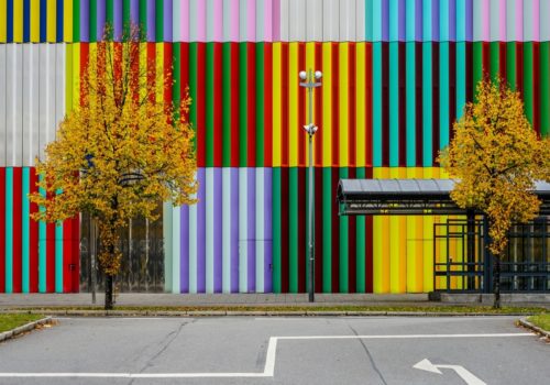
Michael Nguyen photographs Munich’s most colorful shopping centre facade
by Prof. Dr. Rainer Funke
When will the containers be loaded? Such a question comes to mind when approaching the shopping mall built in 2008 from a distance. But stop! The intense colors of the seemingly stacked cubes and their sophisticated composition immediately give rise to other associations. As if someone had created a special order out of building blocks. One wonders whether this is already the perfect final state, as one tries to create with the Magic Cube, for example.
The variety of combinations seems too great for this. Both that of the colors and that of the surface structures. Added to this are the manifold reflections and the astonishing visual dynamics. One does not seem to move past the building itself, but its facades begin to run, to turn, to flow. One is almost reminded of the dancing of the facades and interiors of baroque courtly buildings in downtown Munich. Instead of baroque figurativeness, however, here it is geometry.
The closer one gets, the more details become visible. No, these are neither containers nor building blocks. The prismatic shape of the colored and reflective metal plates gives the building shell pronounced plasticity. One would not have expected so much sophistication from a shopping center, especially not here, where Munich hardly has anything typically Munich anymore and is fraying into the landscape.
Whether red voluptuousness with bold blue, pastel sweetness, noble gold, lush, or pale green: the overwhelming power of color is, of course, the basic theme of the series of images, always in powerfully soaring, a contrast-rich vertical sequence of seemingly endless parallels.
Michael Nguyen’s imposing photographs take us very close to this color organ. They make us stand at attention on the parade ground of the verticals. Especially the severity of the composition in detail becomes a theme.
This gesture appears once again mercilessly emphasized by Nguyen’s camera, as refractions and disturbances emerge from close up. Two framed, square blue lockers, for instance), according to their dimensions probably placed on a blue ground with metallic fittings not colored blue – the attempt to hide them has failed. Nguyen places them in the center. The wonderful striped pattern is disturbed in this way, less perfect and also a bit more lifelike. We experience something similar with the door locks (here the hinges additionally form a counter-rotating rhythm), the intercom, and the stickers on two other images. As a photographer, Michael Nguyen is as uninhibitedly consistent as the facades depicted want to be but cannot be in the storm of life and entropy.
The mirrored surfaces evoke almost poetic associations when nature and urban space gently and carefully combine in them (in one picture, the soft shapes of the snow remains are added). Here, too, Nguyen is provocative. One picture is intended to irritate through eight seemingly irregular horizontal cuts in the surrounding colour surfaces.
And, of course, dirt and trash. Such a design focused on geometric color perfection is highly moralistic. It raises its index finger in full size, admonishing us not to disturb order, to preserve perfection and cleanliness. When we then perceive small discarded things and in addition a dirty floor or even dirty facade surfaces, it hits us with full force. At the same time, we are referred to the particularity and artistic rapture of the facade. Even a traffic sign, placed somewhat askew and in turn, defaced with remnants of a sticker, emphasizes the distance of the art object from life. Even the clash of different grid dimensions of the facade strips and the paving of the sidewalk draws attention and distances. Here nothing has grown out of the ground, where it has been landed. This impression is further emphasized by the filigree grid structure of the surfaces pointing to the left.
If then still objects stand before the work of art, like a somewhat demolished container for the clothes collection, an ashtray (nevertheless in strict vertical-orthogonal high-grade steel form and exactly aligned), or admittedly color-coordinated garbage can one wished a ban mile for objects around the building.
People appear in two photos. They make us breathe a sigh of relief: yes, the whole thing is made for people. The two people in a picture, shot somewhat voyeuristically behind a lamppost, could, however, already be a bit tighter, more upright, and perhaps defilade past the facade in step! The man with his shopping cart, on the other hand, seems to want to save himself from the austerity of the backdrop into the organic world of the leafy settlement.
In an impressive way, Michael Nguyen presents us with this photo series of a building as a work of art and thus points us to the power of design but also to the contradictions between art and life.
Prof. Dr. Rainer Funke
Prof. Dr. Rainer Funke researches and publishes design-theoretical issues from a semiotic, cultural-theoretical, and philosophical perspective and works as a design consultant for companies. He teaches design theory at the Potsdam University of Applied Sciences. After studying philosophy at Martin Luther University Halle-Wittenberg, he earned his doctorate in semiotics and subsequently worked in design-theoretical research at Burg Giebichenstein – University of Art and Design Halle. In 1992, he was appointed to Potsdam as the founding dean of the Department of Design. Rainer Funke was the owner of a design agency, chairman of the board of the Brandenburg Design Center, and visiting professor at the University of Art and Industrial Design Linz.
“Design theory is supposed to motivate in an enlightening way by conveying methods for the analysis of design, especially for the manifold relations between perceptible forms of artifacts and their meanings in the context of the process of use. Design theory explicates modes of action and historically founded developmental relationships of design and their various influencing factors.“ (Prof. Dr. Rainer Funke)
The Mira Shopping Centre opened in 2008 in the Munich district Nordhaide The West, North, and northern half of the Eastern facades, with a total coverage of 5,800 square meters, was made of colored lacquered metal panels which were placed on the walls to form prisms. Since the sides of the prisms have different colors, the façade appears from the southwest and northwest in different colors. In between, a gradual transition takes place, so that the building changes dynamically as one passes by. In addition to the colored panels, the façade also contains panels made of polished aluminum, which reflect the sky and surrounding buildings. The façade construction began in 2007 and was warded with the “DGNB Gold Award for sustainable buildings” in 2009. The shopping centre was planned by Chapman Taylor. The responsible project architect there was Ruprecht Melder. Léon-Wohlhage-Wernik-Architekten was responsible for the façade design.
www.nguyensminiaturen.de
https://www.instagram.com/nguyensminiaturen/