How David Attie invented Photoshop in the 1950’s
By Eli Attie
Okay, my father didn’t invent Photoshop.
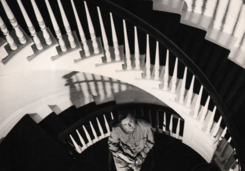
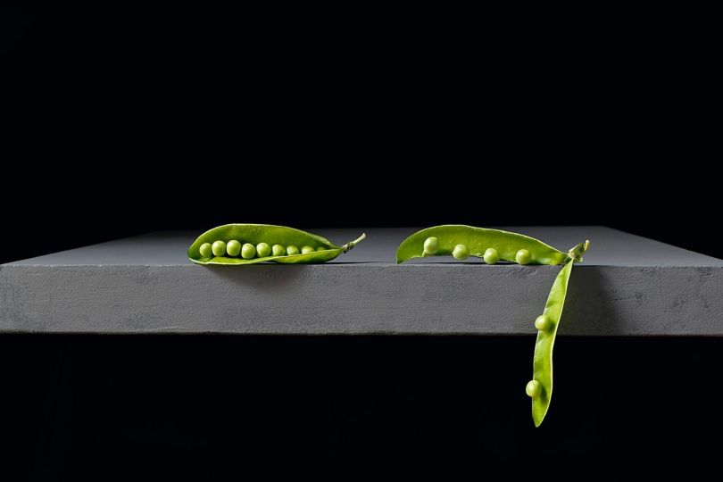
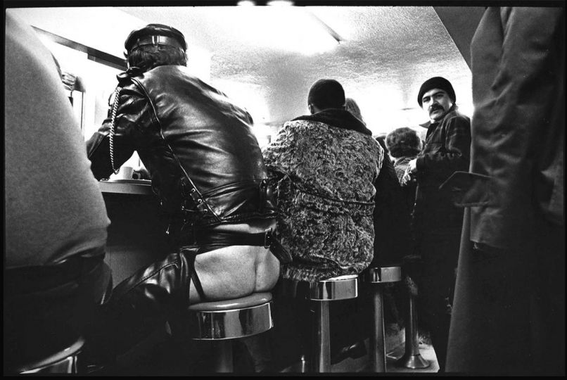
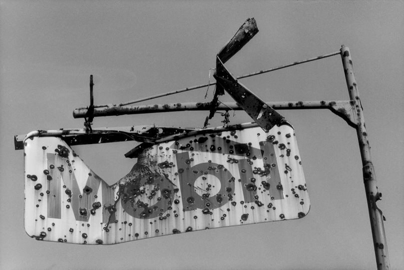
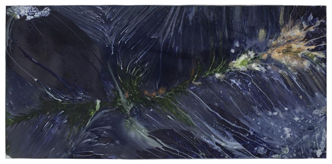
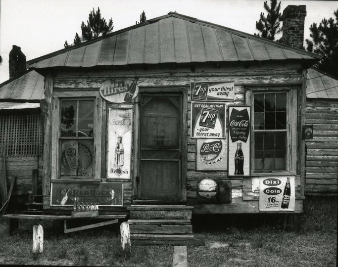
But if you look at his stunning photo-montages, from an era long before personal computers — and even longer before everyone with an iPhone became a poor man’s Ansel Adams -– you’d be forgiven for thinking someone slipped him a prototype.
The fact is, David Attie was creating complex, densely-layered compositions with the technological equivalent of a rock and a hammer. Not bad for a guy who completely, irretrievably botched his first photo assignment.
By now you’re probably wondering: who was David Attie?
After serving in the Army in World War II – during which he painted pinup girls on the noses of combat planes, some of which you’ll find in books – my dad built a respectable career a commercial illustrator. He drew everything from cigarette ads to magazine spreads to the covers of trashy romance novels.
But by the end of the 1950’s, illustration was dying fast. Magazines and publishing houses were turning to photographs instead of those antiquated, Mad Men-era line drawings.
My father decided to make the switch, and signed up for Alexey Brodovitch’s famed photography course at The New School in New York. Brodovitch, the longtime art director of Harper’s Bazaar, teacher and mentor of Irving Penn and Richard Avedon (in whose studio the course was held), is considered one of the fathers of modern magazine design. He’s credited with inventing the two-page spread—which, let’s face it, is a bit like inventing the sandwich. He was a very big deal. He was also a very tough teacher. If he didn’t like your work, he’d rip you to pieces.
One night, in his makeshift apartment darkroom on 55th Street, my father was developing the film for his very first assignment – photos of the original Penn Station, before its demolition. He realized he’d underexposed every single frame. There wasn’t one usable image. And the class was the next day. In other words, he was toast—and so was his new career. In a desperate panic, he started layering the negatives together, to create usable images – and in the process, created moody, impressionistic montages. His life must’ve been flashing before his eyes — and at the wrong exposure.
Brodovitch loved the montages. He spent the entire class gushing over them. And on the final night of the course, he offered my father his first-ever professional assignment: to illustrate a new work by an emerging young writer, Truman Capote. The work was Breakfast At Tiffany’s. It ran in Esquire, the first full-page occupied by one of my dad’s now-signature montages. Not bad for a first-timer.
With “Tiffany’s” as his calling card and both Brodovitch and Capote in his corner, my dad worked constantly after that. And he racked up impressive credits: frequent covers and spreads for Vogue, Time, Newsweek, and Bazaar. Portraits of everyone from W.E.B. Du Bois to Bobby Fischer to The Band. Two books of his own work, 1977’s Russian Self-Portraits, and 1981’s Portrait: Theory (together with Chuck Close, Robert Mapplethorpe and others — not the shabbiest company).
And while his work slowly faded after his passing in the 1980’s, I’m happy to say that it has seen a significant revival. A gorgeous book of his Capote photographs came out about five years ago (Brooklyn: A Personal Memoir, With The Lost Photographs of David Attie, The Little Bookroom, 2015), followed by an eighteen-month show at the Brooklyn Historical Society, and shows in Los Angeles and England too. Later this year, he’ll have another new book, of his behind-the-scenes photos from the very first season of Sesame Street. His work is being licensed and published widely again, and now there is this wonderful exhibit at Keith de Lellis Gallery in New York. (Keith, I should add, remained a true champion of my father’s work — even in the years when it was mostly dormant.)
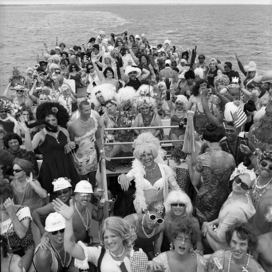
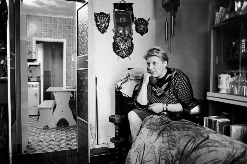
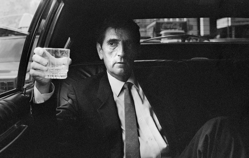
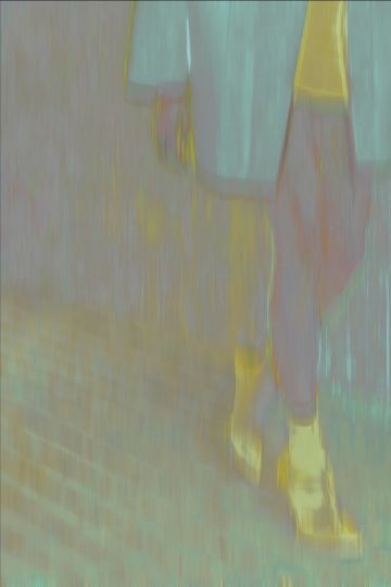
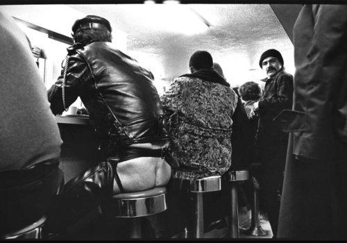
My dad’s work was always wide-ranging. His straight portraiture and street photography were fantastic. But more than any other style, the montages became his voice. A way to express things that couldn’t be captured by the naked eye. A way to make photographic paper his canvass. A way to be different.
His background in illustration no doubt shaped these montages. In fact, he acknowledged this himself; he would often photograph backgrounds and foregrounds separately, and combine them in the darkroom. A standard illustration technique.
But here’s what I find fascinating: his work as an illustrator was good, but in his own words, “never outstanding.” He never tried to experiment. He never tried to invent. He never tried to be different. Until that darkroom accident somehow freed him – to start seeing with his mind’s eye, to embrace the unusual, to use the darkroom not just to develop film, but to develop ideas.
My father once wrote, “My first impulse when I started out was to do battle with photography, to produce images that were anti-photographic. I have never made peace with photography in its simplest expression. I feel the need to interfere in some way with the making of a photograph. I don’t seem to have the ability to leave things alone. It only seems to work for me when I complicate the endeavor. The ideal photograph for me is one that cannot be seen in a viewfinder or even in nature.”
And yet it took a technical mishap to unlock that impulse. There’s a lesson in it, and I think it applies to anyone doing creative work. Who needs to invent Photoshop? The real task is to invent yourself.
Eli Attie
David Attie : Visual Communication
Until June 16, 2021
Keith de Lellis Gallery
41 E 57th Street, Suite 703
New York, NY 10022
(212) 327-1482
www.keithdelellisgallery.com

