Until June 10, the Fotomuseum in Antwerp is hosting a stunning retrospective of Harry Gruyaert’s work. The exhibition begins with European and other shorelines the photographer has explored for decades.
Black and white: intimacy
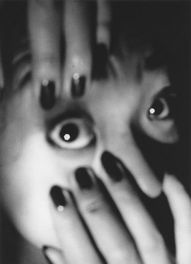
A discreet display case houses a strikingly tender audiovisual montage: over the course of twenty years, the photographer documented in black and white the everyday life of his daughters. The children’s bodies, laughter, and games all exude a sense of familiarity and gentleness.
A siesta on the sofa. An apish smirk highlights the chocolate-smeared chin. This is daily life captured with all the simplicity of a loving eye. “I did it for my daughters, for myself too. It’s not just about my daughters, it’s about intimacy. I carried it out in a naïve manner. In black and white people stand out, they are more important. I’m not concerned with their clothes or with the light. In color, one is looking for something else. In black and white I photograph only my children, a few artist friends, and, in my early days, Belgium.”
From black and white to color
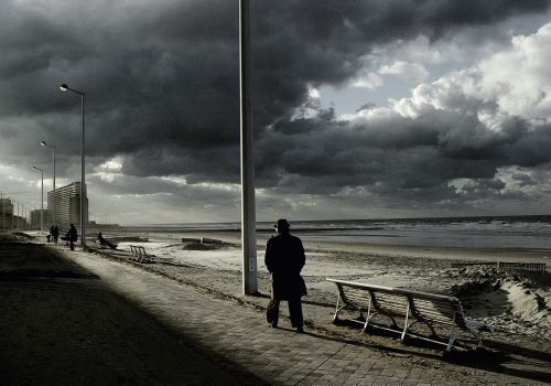
It took some time for Harry Gruyaert to switch from the grays to color. Photographing Belgium was a major breakthrough in realizing the potential of color: “I have a rather difficult relationship with Belgium. I used to be unable to see color. Then a certain banality, even vulgarity came to the fore. I was thus able to photograph Belgium in color with a dose of humor and sarcasm, since I’m Belgian.”
His way of looking at his own country, however, isn’t always ironic. The often-distant viewpoint, pastel colors, and darker shades paint a picture of a country that is as cheerful as it is melancholy. There are popular pleasures such as Flemish carnivals and fairs. There is nostalgia for darker days, as in Ostende, Belgique, 1988. When low and heavy sky weight like a lid…, the work whispers.
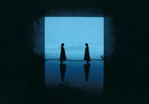
Coming back, photographing anew
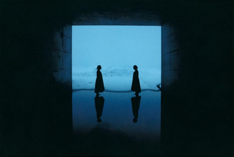
In Belgium, one tends to retrace one’s steps. The exhibition thus opens with Rivages [Seashores], a series about coastlines, littoral boundaries, and views of earth and sea. Harry Gruyaert had photographed coastlines for years without ever organizing his images. It was only in 2004, when he was preparing an exhibition in Arles with François Hébel, then director of the Rencontres d’Arles, that he found in his archives views of the port of Cagliari, the Côte d’Opale, and wafting Irish mist: these were still 35mm. The viewer is moved when looking at a simple ray of light piercing the clouds or at clouds rolling over a sunbathed plain. Some photographs plunge the viewer into contemplation, such as Nice, baie des anges, 1988 [Nice, The bay of angels, 1988]. They’re a response to Hiroshi Sugimoto’s portraits of horizons in Seascapes.
Retracing one’s steps is inevitable. One must love the places and discover them anew, despite the habit and the daily routine. “To Morocco I returned for 25 years. I slept in a camping car for weeks on end,” he explains. “That was another time. There are few places in the world that wouldn’t have interested me in one way or another. I’m curious by nature, and I’m drawn to light wherever it is.”
Blacks and colors
Capturing color implies playing with the shadows. In Gruyaert’s work, the shadow helps bring out the tonalities. Colors shimmer, reverberate, and reflect in black (La Courneuve, Paris, 1986 and Waterloo, Belgium, 1981).
The color black plays the role of counterpoint. The presence of shadows in Harry Gruyaert’s work is fascinating: shadows seem to swallow everything; what escapes is the colors. He explains this power of color by the use of Kodachrome film:
“Black produces certain density. The Kodachrome film used to have beautiful blacks. It was the only film I would use. I’ve never found that sort of saturation or level of detail in any other film. Sometimes I was obligated to pick other films. Fuji film produced swathes of color like in Japanese painting. Kodachrome was amateur film, and it was possible for the machines to cut an image in half. There was no point of filing a complaint with Kodak. It was the best film ever made.”
What we’ve seen before
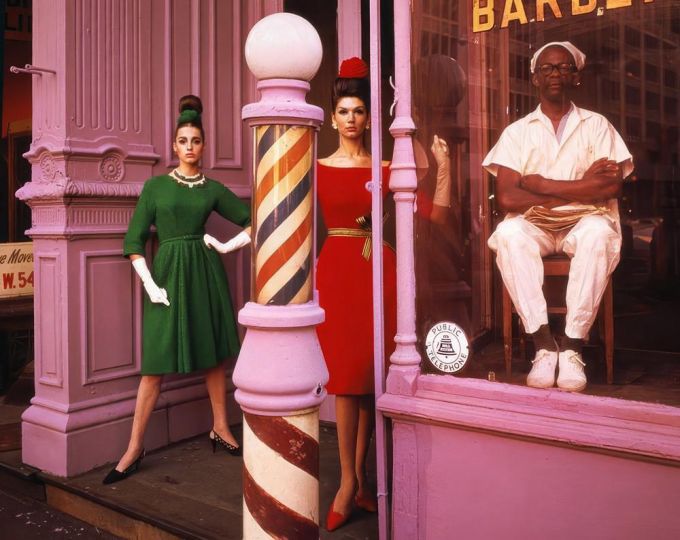
Similar to a book publication, a retrospective may help to understand “what we’ve seen before.” Among books, “some become exhibitions, and other times exhibitions give rise to books,” he explains. East/West, one of his latest releases, confronts what the United States and Soviet Union used to represent visually in the mid-1980s.
In the West, countless signs and billboards saturate visual space. Streets are cluttered with tasteless decorations, and garish colors bedeck the public space. Life seems excessive, both smart and silly.
In the East, colors convey the tedium of people’s lives. These colors seem perhaps more authentic, even though they lack brightness. Interiors, especially in hotels and businesses, are covered with drab, worn paint. One can measure the anticipation of passing days. Everything seems more tenuous, more obscure, more immobile.
This series has some affinities with Harry Gruyaert’s first book about Moscow, City Portaits. There we see the Soviet capital in 1989, then again in 2009. “The city barely resembles itself. There are more signs, ads, billboards. Photography provides a point of reference for how things used to be.”
Television and Simenon
Among his early artistic productions, we find some work on television. The essential productions, TV Shots, are presented here as giant projections on four screens. The images, captured by manipulating TV screens in London in 1972, constitute sort of innovative bedroom reporting as well as a critique of the media at the time. Toward the end of the exhibition, the photographer pays homage to his great source of inspiration, the filmmaker Antonioni.
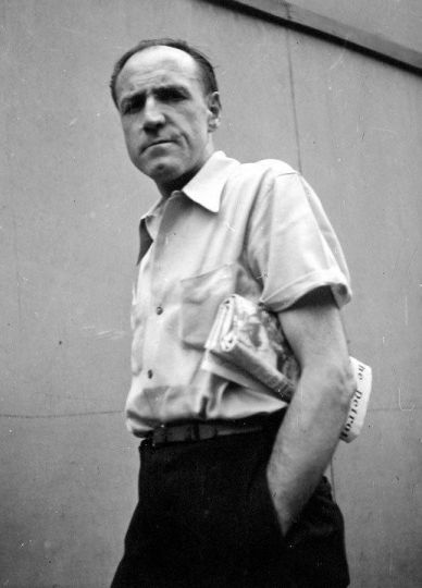
Another astonishing work is a set of illustrations commissioned by Penguin for the English editions of Georges Simenon’s thrillers. “I had no faith in the Simenon series when I was asked to take it on,” he recalls. “It was Peter Galassi, former photography curator at the MoMA, who approached me. Penguin was looking for relevant covers. An archivist from London would come regularly having read the forthcoming book. We would look together for an appropriate photograph. I hadn’t imagined that we would find so many images in resonance with these novels.”
Titled and formatted vertically, the image perfectly conveys the uncanny atmosphere of secrecy in Simenon’s novels. The publishing experience was a success, and so is the exhibition.
Arthur Dayras
Harry Gruyaert – Retrospective
March 9 to June 10, 2018
Fotomuseum
Waalsekaai 47
2000 Antwerp
Belgique