Giving a form, making a photographic project tangible: the work of designing a personal exhibition requires a time of reflection and preparation that is both necessary and engaging. From the selection of images to their printing, through their organisation and framing, photographer Benjamin Rullier tells us about the process of putting together his Scabieuse series.
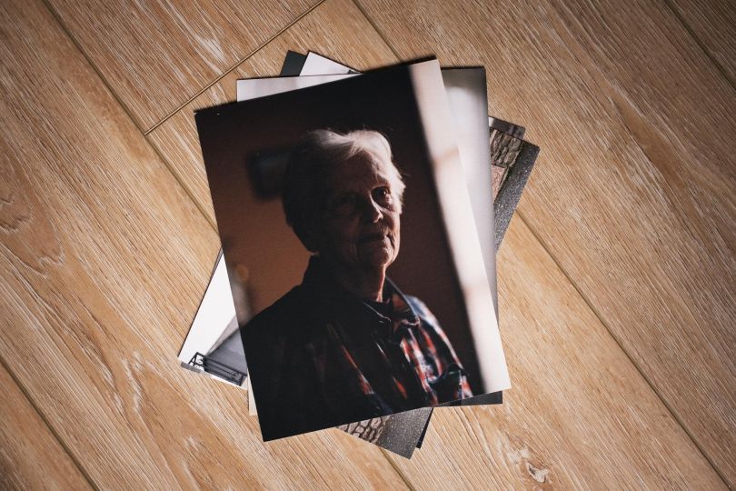
The pincushion flower is a flower that is also called the “widow’s flower” and which became the title of a series I have been working on for some time. It focuses on women living in rural communities who have been living alone since their husbands died. The series shows their faces, their bodies in their daily environment and also gives short quotes from our encounters. As with each of my projects, I wish to make images and texts resonate.
To give this series an exhibited form, I first thought about its distribution. The idea is to make an exhibition that can be presented in small spaces: small galleries, bookshops, etc. and that can be looked at as if one was looking at a wall on which a few family portraits are gathered. These objectives conditioned the number of images and texts to be printed, as well as their size.
Sketching a shape
I like small formats, works that you have to get close to in order to see and understand, so I chose two modest sizes for the images: 13x18cm and 18x24cm, and a square format for the texts: 15x15cm. In working out a sketch of the exhibition layout, I concluded that seven to eight photos and as many texts could make up a series that was both representative and of a format that suited me. The choice of photos and images was dictated by these constraints and by the desire to tell a story, to bring in a theme, a vision of the subject. I chose to gather these impressions in a rather narrow way, at different heights.
What I want to show is not a story that progresses: it is a collection of testimonies and faces around a central theme, that of disappearance. I have thus chosen to have all the widows’ faces forming the outline of the exhibition an in the center, an image representing an empty armchair that illustrates the starting point of this project. I also chose the texts, drawn from a fairly large number of quotations, by selecting evocations of the lives of these women since the death of their spouses. They evoke absence, mourning and reconstruction. They gravitate, in a light-hearted way, around these photos.
Experimenting the setting
I wanted to frame these images in cases that reminded me of those I have seen in the homes of these ladies: old frames, sometimes coloured, colourful. With this in mind, I chose to print the images on Hahnemühle Photo Rag, a very matt 300g paper that will be slightly raised by the glass. A paper that can have an almost rough appearance but whose precision and depth I liked. The texts, which I wanted to display in a simple and unframed way, were printed on a softouch matte paper with a very soft appearance. All these prints were made by the online printer Saal, which offers high quality fine art prints in a very interesting range of formats.
When I received the images, I was able to test my device, test the framing and the layout of the exhibition, which in the end did not change much from the planned sketches. The two formats, almost homothetic, fit together easily and in my opinion the multiplication of different frames does not make reading more difficult, which I had feared at the beginning.
Of course, this arrangement will be put to the test of the potential places that will accept to show this exhibition, but it allows to project oneself more concretely in this series and to give it a real, arranged, thoughtful form, which offers a personal reading, different from the one that can exist on the Internet or in a book.
A photographic series published in the framework of a partnership with Saal.

