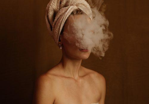
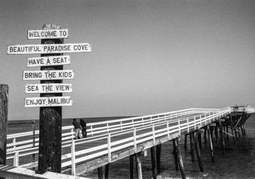
Nailya Alexander Gallery presents Life in Color, a selection of painted photographs by artist and photographer Ann Rhoney, through the 20th of July. Sofía Granados Dyer from the gallery interviewed with her.
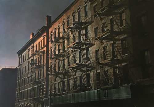
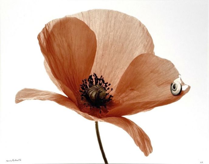
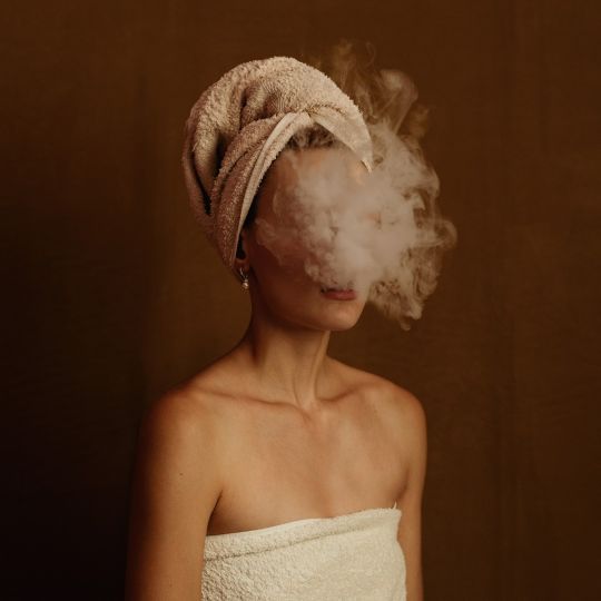
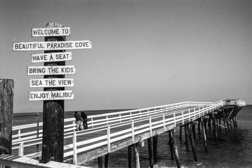
Ann Rhoney’s artworks unify the purity of photographic light, and the vibrancy of painted color. As an undergraduate at Cornell University in the 1970s, Rhoney fell in love with photography, but was disillusioned by the limitations of color film. She wished for her photographs to faithfully express the infinitely vast spectrum of color that the eye can see.
Her natural response: to apply transparent oil paints directly onto her gelatin silver prints, transforming her photographs into atmospheric painted canvases. Through Rhoney’s storied career, she has witnessed innumerable advancements in film and digital technology, but remains dedicated to her painterly practice.
I spoke to Rhoney from her hometown of Niagara Falls, in anticipation of her solo exhibition, Life in Color at Nailya Alexander Gallery. She spoke of the Falls, a setting that has inspired the writings of Nathaniel Hawthorne, the landscapes of the Hudson River School, and her own life-long pursuit of light and color. She also provided startling insights into the reemergence of process-oriented artworks, and her own insistence on the integrity of the finished product. Her photographs reveal the “previously unseen,” the light and color of everyday experience, if only we choose to look.
Rhoney’s photographs can be seen at her upcoming solo exhibition at Nailya Alexander Gallery, on view from June 5 to July 20. Her photographs have been acquired by museums such as the Metropolitan Museum of Art and the George Eastman House and have appeared in New York Magazine, New York Times, and New Yorker, among others.
Sofía Granados Dyer : Your hometown of Niagara Falls is a continual point of return in your work. Can you talk about its significance to your artistic practice?
Ann Rhoney : As a teenager I worked at the base of the falls at the Maid of Mist boat dock. One summer I worked night shifts with my cousin in the little souvenir store sorting post cards. At night, colored lights are shown on the falls. With the mist, light and color dance. Growing up in Niagara Falls, I saw colors that were surreal: between the falls and the mist, and colors of the sky that are a result of the chemicals from local industry combining with the environment. When I see colors that appear a bit beyond the norm, it’s because they are real. There are certain times in our lives, certain days, certain conditions where we see colors that surprise us. They’re right there all along. These extraordinary conditions heighten our sensory awareness, revealing new colors and a new way of seeing.
If you think of a rainy street, there’s all those pools of color: wonderful color with wonderful light. But right now where I am, I see where it came from. Niagara. It’s everywhere. Light and color is really alive. That’s why I’ve stayed true to the work since I was a teenage girl. That’s where I found my strength, with light and color.
SGD: When did you know you wanted to start painting your photographs? What motivated your first works?
AR: I started painting as a girl. I lived near legendary whirlpools and after I did evening chores I would run to Whirlpool State Park at sunset. The skies were beautiful. That’s when I started painting, where so much of my love of color came from. That would have been around the same time that I sent you that song from Youngbloods, “Ride the Wind,” right? How in the wind, the colors expand. That was ‘69.
I wanted to be a painter, but when I went to college at Cornell, being a painter wasn’t fiscally practical so I became a design major. In design we had a class where we had to document our projects. It was a photography class, but lo and behold it was an independent study in darkroom, which was unheard of (What kind of special 2-credit class was this?). I took this class and did terrible because I couldn’t roll the film, and I would mix the wrong chemicals. I loved photography so much, but I just couldn’t get darkroom. Concerned about my grade, I asked to drop the class or to get an incomplete. My professor refused to let me drop the class until I understood darkroom, so I stayed and worked all summer. He was thrilled, thank heavens! If we are aware, we can appreciate extraordinary people we meet along the way who greatly enhance the quality of our lives. I look back at a lot of those photos and they’re very strong still. They have to do with light. Often I took photographs on assignment or when I investigated something intriguing for a series. But when I take a photograph that says to me “take the picture” — it’s the light. There’s something magical happening with the light.
SGD: Did you teach yourself to paint your photographs?
AR: I had about a five-minute tutorial from a person I admire, and her name is Gail Skoff. When I was 23, I took her history of photography night class at UC Berkeley. In a few moments she taught me what I needed know. She and Elizabeth Lennard were doing wonderful painted photographs in the late 1970s. It is a still a delight to know that we all had different visions and have grown since then.
I’ve developed my own method of applying color to a photograph. It is a wonderfully exciting experience to use color to work with dimension. Because of the pure whites, the light of the silver print photograph becomes brighter when I apply color, creating other dimensions on a 2-D picture plane.
SGD: You’ve mentioned Goethe’s passage on transparent color in his classic 1810 Theory of Colours, as being particularly significant to you. He writes about how “colors catch fire, and mix, and reappear, and disappear.” Why does this passage particularly stand out and why have you been so dedicated to transparent paint?
AR: I believe the premise of photography is to find the authentic meaning of light through experience or emotion. It’s the pencil of light. It might get lost somewhere that I am a black and white photographer, but if there wasn’t the beauty of pure, unadulterated light of the silver print, there wouldn’t be the beauty of the painted piece. The black and white foundation is what’s important. That’s the soul of it.
I’ve always used oil paint because of the translucency. Because the paint is transparent, the tone is always faithful. It’s a wonderful truth for me to look at a tone and say ok, you’re a middle gray. You’re never going to be a light color. I work with color to gain more depth. It’s a complicated challenge to figure out where to go with the middle grays, the lights, the darks, with the color. That’s why I love the Goethe quote about the beauty of transparent color, and the air and the light.
SGD: Can you talk about your creative process?
AR: There’s a fascinating emphasis on process today. Is process the final goal, or does it allow you to finish the piece on a deeper level? In the early days, Anna Atkins, Henry Fox Talbot were of course, experimenting with cyanotypes and calotypes, but the final photograph was just as important. We’re now experiencing a reaction to digital photography that makes me wonder what the future of imagery will be? Surely the method of creating a photograph isn’t more valuable than the artwork produced?
The irony is that I’ve always been seen as a photographer working with alternative process. It’s important that my work is often painted, as that makes them what they are. Yet I strive to preserve the integrity of the piece, the vision. I believe that when you create a work of art, emotion should finish the piece. I like to leave a sense of mystery so that the viewer can complete the work with their own unique imagination. Emotion is the most personal of the senses.
SGD: Do you see yourself more a painter or photographer?
AR: I think I’ve done my work so pressingly because I wanted to be a painter. I was on a tightrope of — am I a photographer or a painter? I wanted to be a painter, because light enchanted me, but when I was 22 or 23 there was more opportunity to be a photographer. It was and still is a whole painter-photographer question of who am I?
SGD: Do you think you have settled that question? Do you see yourself now as one or the other?
AR: Now I feel more a painter. It’s still the draw between light and color. Light is photographer and color is painter. What excites me is light and color — the mystery of how they marry. Color in the right light can be phenomenal and very dramatic. Then you just add a touch of color like the red line on the leg in Sweet Georgia Brown and all of a sudden there’s a rejoicing, scintillating light.
SGD: In a way, your work escapes the historical tension between photography and painting. How do you think that tension has changed now that photography has become a more established practice?
AR: Maybe photography and painting go hand in hand with how we see and feel emotion. Perhaps when you look at a beautiful painting you look at the color, and you’ll appreciate the color in a photograph another way. Sometimes if you see a photograph that has remarkable form, you’ll appreciate a painting more. I’d like to believe that they lend us a way of enlightenment of the other process and shouldn’t be competitive, rather give us a clearer way to open our eyes.
I see painting and photography work hand in hand to reflect life as if through a mirror. I’m greatly inspired looking at paintings, I believe painters get inspired by photographs. Many painters work with photographs for their sketches. The two media may be more symbiotic than anyone thought they could be. It’s about the intimacy of pure emotion rather than the process.
When I started, it was a black and white world — yet here I was creating color from black and white prints. Eggleston wasn’t recognized for doing color yet. Color was taboo. That’s really something when you think about it. Since I’ve seen so many trends, I really feel free right now knowing that the world will change again . . . I’ll just keep doing what I’m doing.
SGD: What’s your opinion on the recent comeback of alternative-process and color film over digital?
AR: Two or three years ago everything was trending toward pigment prints. Who would have thought that gelatin silver print would be an alternative process? I think that’s why everyone is process oriented, to create a uniqueness. People are after throwing paint on images to all of a sudden give it something of a uniqueness and specialness since everyone now is a photographer. Where is the elegance, the dignity of the range?
Perhaps adding paint to artworks has something to do with wanting to make a personal statement. People want to put their own touch on something. That’s why I think a lot of kids who grew up with digital are the ones that want to take darkroom classes. Because they want to go deeper. They want more. Whereas if you grew up with film, it may be different. The more seasoned generation may think “digital is easy,” or “now we don’t have to go into the darkroom.” But people growing up with phones are seeing the richness of the darkroom as a meditative space and process. It’s all about going deeper, exploring one’s intrinsic inner nature, rather than the instantaneous way that we often view and post images digitally. Take it, post it, see how many likes, delete. The integrity of the image with such a short life is often lost.
SGD: How do you think digital photography has impacted our everyday sensory perception?
AR: When I started working with digital it was fun because I could do a lot of novel things. But then I started questioning the color. Again. Adobe 1998 is a beautifully free range of colors to create prints from, but then as the image is viewed on the visual lingua franca of today — the iPhone or a mobile device — it goes to sRGB, which basically converts color for web and mobile. The saturation is highlighted in certain colors and other colors totally vanish. A strong example of this is if you look at a digital sunset. None of the peach tones are in the color gradations. When you watch a movie, like a Western that is technicolor, the cowboys go off into the sunset. If you watch a digital movie however, even when the colors appear phenomenal, it’s often from the depth of saturation, as the more nuanced colors disappear.
If you have a really great system, there’s so much that could be done with color management. But the resources needed were so much simpler a few years ago. To keep up with it now is enormously challenging. In most images that we see on phones, the saturation is crazy. So many of the mid-tones are lost and they are farther from the reality that color film was giving us. I’m reliving what I went through with color film, but now with digital. I think that’s why I have been painting all along. Because it is more faithful.
SGD: I would like to ask about one artwork, Waiting to Run, Tijuana in your upcoming exhibition that is so striking to me. The photograph is grounded in themes of light, atmosphere and color that distinguish your artistic practice, but a social dimension comes forth as well. Can you talk about this piece?
AR: I took Tijuana on an assignment for Newsweek about immigration. People at the border stared at me wondering what I was doing there by myself. I would smile, but they were so afraid. Everyone was searching for the moment when no one was looking to run toward California. The children would smile at me, perhaps because they didn’t understand.
When I took the photograph, I was standing in horrible muck — I remember throwing my shoes away after. There was something else about that family, the fact that they were only taking what they had in that “fresh new” plastic bag with them in the hopes of starting a fresh new life, that still sticks with me. A sign of hope. The mother looked back at me quickly, but then relaxed. I tried to calm the family down through my facial expression, reassuring them that I wouldn’t show their faces for their safety. It was important to maintain the dignity and privacy of their faces. They ran, but I don’t know what happened to them. When I printed the photograph, I was happy the tenderness was exactly as etched in my mind at the moment.
Perhaps the social dimension goes back to my upbringing in Niagara Falls, a place of such incredible contrasts. It faces serious problems and is also the most beautiful place on Earth. Growing up there, my friends and I were always aware of reality.
SGD: What do you ultimately want to leave viewers?
AR: Light and color are sensual elements we all share. My hope is that the work may strike a chord within the viewer’s imagination and illuminate a richer perception of their own reality. A sense of wonder with the previously unseen.
Ann Rhoney, Life in Color
Until July 20th
Nailya Alexander Gallery
41 E 57th Street, Suite 704
New York, NY 10022

